When doing accessibility tests on a website, it's important to keep in mind the present context, unlike HTML testing, which simply has to review the web page source code to ensure it complies with current standards. In accessibility testing, that context is the browser that we're utilising to render the web pages.
Thanks to responsive design, web pages adapt to the viewport size of each device. So for example, if we visit Github.com on a laptop with a screen of 1440x900 pixels, we'll see this:

But, if we visit that site using an iPhone 13 with a 390x844 screen, we'll have this instead:

And, if we rotate the device, then we'll have this:

What this means in the context of automated accessibility validation is that we need to specify the viewport we're using to render the web pages at the time of checking them, because their design varies in adaptation to the viewport.
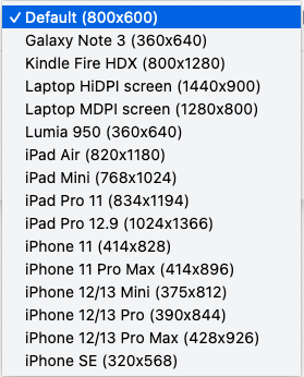
Until now, Rocket Validator has been using the default of 800x600 pixels, but now you can choose different viewport sizes to be used in your site validation reports, thanks to the brand-new Device Viewport Emulation feature, available to all Rocket Validator Pro users.

Check out the list of available devices to see the complete specs including width, height and device scale factor.